Warm or Crisp Light in a Casino Interior?
Warm or crisp light in a casino interior can change how stone, metal and colour read; use this seasonal review to refine the room without flattening it.
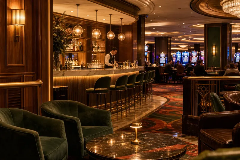
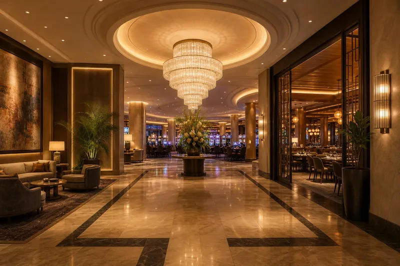
Warm or crisp light in a casino interior can make the same brass rail look burnished or pale, and the same carpet appear richly coloured or slightly grey. The effect is not a simple choice between cosy and clinical: it depends on what the light touches, how much daylight enters, and what guests see together in one glance.
A useful way to judge the balance is to review the room over a realistic week, then revisit it as daylight and operating conditions change. The aim is not to impose one lighting character everywhere, but to understand how each area’s materials and colours respond before making adjustments.
What light reveals
Warm light tends to bring out red, amber and brown notes in timber, leather, brick and some stone. A walnut veneer may look deeper; a cream wall may take on a buttery cast. These shifts can lend a room a settled, intimate quality, but they can also make cool greys seem muddy or disguise the distinction between similar dark finishes.
Crisper light can make whites and blue-green tones look clearer, and can give polished metal a sharper glint. Pale marble may appear cleaner, while dark wood can lose some of its red richness. If the colour is too cool for the room’s materials, the effect can feel detached, especially where glossy surfaces throw bright reflections into sightlines.
Neither impression is produced by colour temperature alone. A shaded wall, a narrow beam, a bright display and the finish of a lampshade all shape what reaches the eye. Surface texture matters too: brushed brass scatters light differently from a mirror-polished edge, while velvet absorbs it rather than returning a crisp highlight.
Judge a finish in the light that actually falls on it, not only beneath a sample-room lamp.
A week of observation
For a practical review, assign a different question to each day. Keep the existing setting stable while observing; changing several controls at once makes it hard to tell what has altered the room’s character. Note the location, time, light source and material being judged, rather than relying on a vague impression such as “too cold”.
- Day one: establish the baseline. Record which areas feel warm, neutral or crisp, and identify the surfaces that draw the eye. Include both the intended focal points and any unexpectedly bright patches.
- Day two: inspect timber and leather. Look at seating, wall panels and handrails. Ask whether their tones feel distinct from one another or merge into one broad brown field.
- Day three: inspect stone and paint. Compare a pale floor, a painted wall and any stone counter or column. Watch for yellowing, greying or colour shifts that make adjoining finishes seem mismatched.
- Day four: inspect metal and glass. Check brass trims, chrome details, mirrors and glazed screens from normal viewing positions. Note glare and reflections as well as colour.
- Day five: revisit at a different daylight condition. Observe the room when daylight is stronger or weaker than on the first day. Record which surfaces change most and whether electric light still gives them a coherent appearance.
- Day six: ask a fresh observer. Invite a colleague unfamiliar with the review to describe the room’s materials and mood in ordinary words. Listen for disagreements between the intended character and what is visible.
- Day seven: group the findings. Separate colour issues from brightness, glare and unevenness. Decide which observations point to a local adjustment and which suggest that the room’s general balance needs reconsideration.
Say a fictional casino lounge has honey-toned oak, dark green upholstery and a pale stone bar. During the week, the oak looks appealing under warm light, but the green fabric turns nearly black and the bar takes on a yellow cast. The team could consider a more neutral or crisper treatment at the bar while retaining warmth around the seating, then review the materials again under the room’s changing daylight. The expected visible result would be clearer separation between the green, oak and stone, not a claim that one setting suits every guest or surface.
Room by room
In a lounge, warmer light can support the depth of wood and fabric, particularly where guests sit close to the finishes. Crisp light may be more helpful at a pale stone surface, a display of objects or a wall treatment whose colour should read cleanly. A mixed approach can work, provided the transition feels deliberate rather than like a patchwork of unrelated sources.
Dining areas call for attention to both the room and the food. Warmth can enrich timber and soft upholstery, while an overly amber cast may shift the appearance of pale walls, glassware or colourful dishes. Crispness can help details read clearly, yet sharp reflections from cutlery and polished tabletops may compete with the setting. Consider the view from a seated position, not only the impression made at the entrance.
In a gaming area, the surfaces are often visually busy: patterned carpet, illuminated displays, metal details and dark furniture can sit close together. A very warm cast may blur distinctions among reds and browns; a very crisp one may intensify reflections and make chrome or glass feel insistent. Look for a balanced rendering of nearby finishes, rather than trying to make every element equally prominent.
For a quieter corridor or transition space, consistency between adjoining materials may matter more than a dramatic colour effect. If a warm lounge opens onto a crisp, pale passage, the contrast may read as an intentional change of atmosphere—or as a jarring break. Check the threshold from both directions before deciding which interpretation fits the interior.
How should you judge the balance?
Does warm light make every room feel more welcoming?
No. It can flatter wood and leather, but may make cool paint look dull or pale stone appear yellow. The material palette and the room’s purpose should guide the choice.
When does crisp light suit an interior?
It can help pale surfaces, blue-green colours and fine details read distinctly. Consider it carefully around glossy finishes, where reflections can become more noticeable.
Can warm and crisp light sit together?
Yes, if each treatment has a clear relationship to the surrounding materials and the change between areas feels considered. Check the shared sightline so one room does not make its neighbour look unintentionally discoloured.
What should you check before changing a fitting?
Confirm the lamp and fitting specifications, dimming compatibility and the manufacturer’s guidance. Where electrical work is involved, use a qualified professional.
Make adjustments carefully
Once the observations are grouped, choose one issue at a time. If the stone looks yellow but the wood feels right, assess the light falling on the stone rather than immediately changing the whole room. If metal glare is the problem, the angle or direction of the source may deserve attention before its colour quality does. A lighting designer can help separate those variables when the result remains unclear.
Keep a short record of the existing setting and the reason for any proposed change. Describe the intended visible effect in material terms: “the grey wall should remain neutral beside the oak” is more useful than “make it brighter”. Review the result from ordinary guest viewpoints, including seated positions and the approach from adjoining spaces.
Warm or crisp light in a casino interior is best treated as a way of shaping how materials and colour meet, not as a signature setting to apply across the property. A seasonal review can reveal when daylight shifts the balance, while a room-by-room check keeps each surface in context. The most useful final question is simple: can guests still read the materials as the designer intended, without one finish stealing attention from the rest?